Table of content
The majority of traders use charts in Forex to conduct technical analysis and predict upcoming price movements. Charts give you a visualization of price movements of the currency pairs that you are trading. The movements on charts can be represented in various different forms.
For example, there are charts that show movements in lines, candles, mountains, and many others. Charts have different time frames as well, such as minutes, hours, days, months, or even years.
Technical analysts use Forex charts to predict future price movements according to the past. Most of the Forex brokers provide you with free platforms, which gives you access to Forex charts as well.
For beginner Forex traders, understanding Forex charts might be a little confusing. If you want to learn everything about charts in Forex, this guide will prove useful for you. In it, we’ll explore every important detail about charts, whether it’s different chart types, timeframes, or the technique to better predict future price movements using them.
Understanding forex charts meaning
 Price movements on Forex market charts are shown in a very simple way. The x-axis, which is the horizontal line of the chart, shows the time frame. On the other hand, the y-axis, which is the vertical line, shows the price of the currency pair.
In the majority of cases, charts are part of the trading platform. You will be able to use them once you have opened a demo or live account. Also, there are many third-party companies that offer free Forex charts.
You should already know that in Forex, prices are constantly changing. Sometimes they go up, and sometimes they go down. These are the movements that you can see on Forex charts.
If you see that the price is low and there are signs that it will increase, you’d usually want to buy the asset, and if the price is high and is showing signs of decreasing, you’d usually sell it.
Most popular types of Forex charts
Most of the Forex brokers offer traders free charts. These are mostly offered through trading platforms, such as MetaTrader 4, MetaTrader 5, cTrader, Web-based traders. Some brokers even offer their own platforms!
It is true that every chart shows the price movement of a certain trading asset. But there is a lot of variations of Forex charts, such as:
- Lines charts
- Mountain Charts
- Bar Charts
- Candlestick Charts
- Heiken Ashi charts
Let’s discuss every one of them one-by-one.
Forex charts explained – Line charts
The most basic and simple chart in Forex is the lines chart. Lines chart represents the price movements in the market in a very simple manner. Just by looking at the chart, you will be able to tell how the prices are changing.
This chart marks various price points of a certain currency pair, and then, it connects the neighboring points to each other. This results in showing the price changes in lines. However, they are too simple for many traders. There are no closing prices shown by this chart.
Because of this, not everyone uses it. If you are a trader who wants to get complex information such as opening prices, closing prices, or the highest and lowest prices of the trading day, a line chart would not be helpful for you.
Still, there are many people who use Line live Forex charts, mainly because they can get the major and most important information about the market trends in a very easy way.
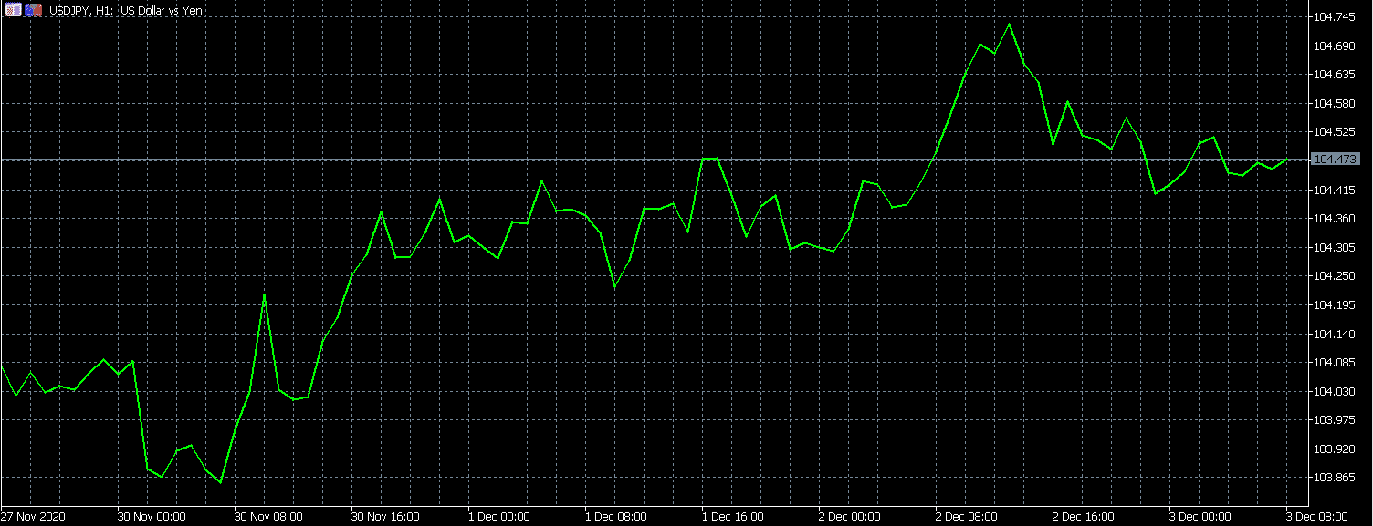
You can see the USD/JPY line chart above. As you can tell, there is not so much to be learned about price movements from this chart. It only shows the major price changes in a currency pair.
Knowing Forex charts – Mountain charts
In a way, Mountain charts are very similar to line charts. The major difference between line and mountain chart is that mountain charts have the space below them filled in with color. Mountain charts are also many times referred to as area charts. It is a financial chart with peaks and dips, and it looks like a side of a mountain. This is where the name comes from.
Mountain charts are mostly used by traders who want to grasp the major changes over time. Just like the line charts, these ones will not give you in-depth information about price changes of currency pairs.
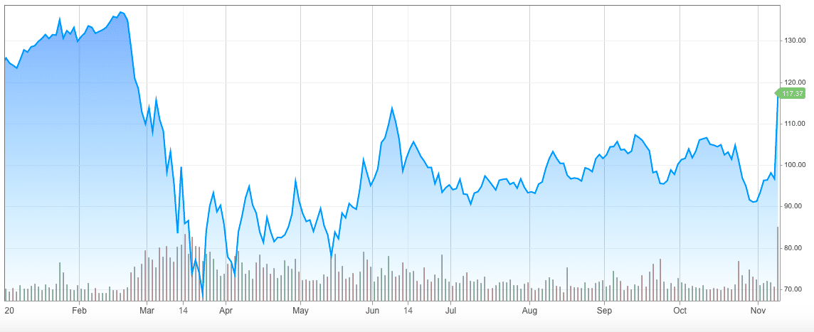
The picture above shows the mountain chart. Price movements of American Express’ shares are shown in this mountain chart, and as you can tell it looks similar to the line chart. The main difference is that the space below the lines are colored, which makes it look like a mountain.
Reading trading charts – Bar charts
Unlike line or mountain charts, bar charts are known to be more complex. In a given time period, the bar chart will give you information about four different prices of the currency pair.
The top and bottom ends of the bar show the highest and lowest price points of the currency pair in a given time period. Then there is a short vertical line on the left side, which shows the opening price, and the same line on the right side shows the closing price.
For obvious reasons, there are more traders who use bar charts than those who use a line or a mountain chart. While the other two can be very helpful to see the major trends in the market, the bar chart will give you the more detailed information.
This information can be very helpful to make decisions while trading Forex. But, although bars are very complex, there are other charts that will give you even more information about the price changes.
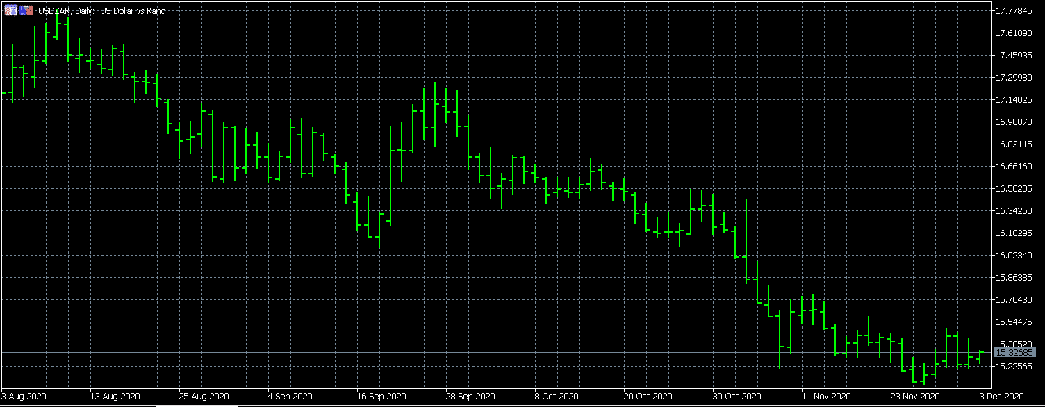
In the bar chart shown above, you can see the price movements of the USD/ZAR currency pair starting from August 3. Compared to the other two charts that we have discussed before, this one shows a little more detailed information.
Forex chart types – Candlestick chart
When thinking about Forex trading, for me, personally, the first thing that comes to mind is the candlestick chart. This kind of chart combines the best parts of the above-mentioned chart types. So, it should not come as a surprise that the most popular method for showing price movements in Forex is the candlestick chart.
As we have already said, the bar charts show only four prices in just a one-time period. Line charts and mountain chars only show one price in a longer time frame. When it comes to the candlestick chart, it shows four prices in a longer time frame. The time frame of price changes can be set by you according to your preferences.
In candlestick charts, the space between the short vertical lines is called the real body. If the real body is green or white (they are mostly shown in these colors), it means that the opening price was lower than the closing price. If the real body is black or red, it means that the opening price was higher than the closing price.
On top of the real body, you can sometimes see a narrow line. This line is called the upper shadow and shows the highest price point. Below the real body, there is another line, called lower shadow, and it shows the lowest price point of the given time.
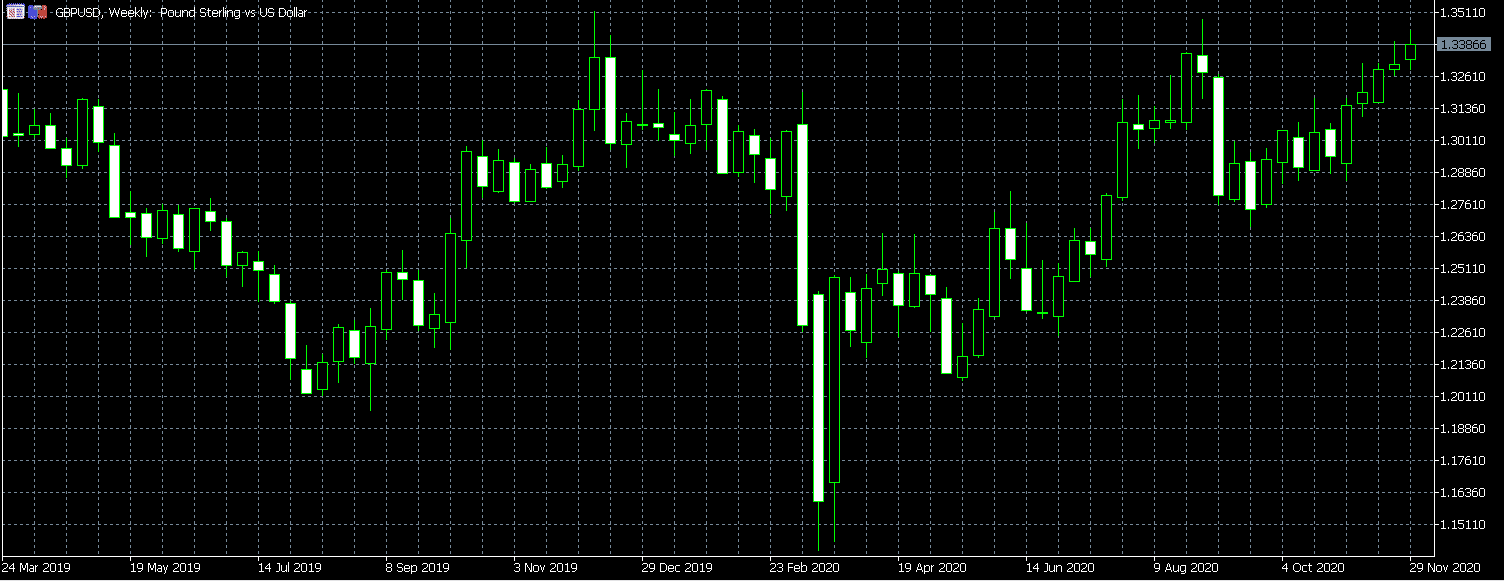
The GBP/USD candlestick chart above gives you very detailed information about the changes in the market. You can see the opening prices, closing prices, and highs and lows of the trading day. Because there are so many things that can be learned from the candlestick chart, a lot of traders are using it.
Forex charts reading – Heiken Ashi chart
The Heiken Ashi chart, in a sense, is very similar to the candlestick chart. Many traders are actually having a hard time telling the difference between these two.
The major difference between the candlestick chart and the Heiken Ashi chart is very simple. Heiken Ashi gives general information about the price changes. It is a good chart to see the major trends, but the details are not as significant as it would be with the candlestick chart.
The Heiken Ashi was developed in Japan and the color of the candlestick at this chart denotes the direction the price is moving. This chart mainly gives information about uptrend or downtrend.
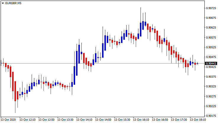
The Heiken Ashi chart above shows the price changes of the EUR/GBP currency pair on October 13. The daily chart above shows the major trends in the market. Although this one is not 100% accurate, many traders still use it to understand the major trends of the currency pair.
Why do people use Heiken Ashi?
Heiken Ashi in Japanese means ‘average bar’ and is mostly used to spot the major trends in the market. Many people use it to easily read candlestick charts. This makes the analyzing process much easier, especially for beginners.
The close and open levels in Heiken Ashi are calculated in averages. So, when you see the closing point at Heiken Ashi, it is open + close + low + close divided by 4. Opening price in Heiken Ashi is calculated by the following formula: Open of previous Bar + Close of previous bar / 2. It shows the midpoint of the previous bar.
Most of the people using Heiken Ashi are beginners, who are new to the market and are looking for a way to easily understand the major trends in the market.
Other types of Forex exchange charts
We have discussed the major and most popular Forex trading charts, but there are more of them available online. Some Forex brokers will offer you advanced Forex charts. In most cases, these Forex charts will offer you different types of indicators and drawing tools.
Advanced charts are mostly created to make trading much easier, but whether you will be able to use them or not depends on the Forex broker that you are using. Many brokers also have Forex mini charts, which are a great way to quickly see the market changes.
How to identify Forex charts patterns
 Forex chart patterns are the price action patterns that have a higher than average chance of follow-through in a certain direction. Many traders are using patterns to decide which position to open. There are three major types of chart patterns, and understanding Forex chart patterns can be very helpful for you.
One of them is called the continuation chart pattern, which appears when the price is trending. If you see that there is a continuation of the chart pattern in trend, it means that the price is correcting. This means that it is more likely for a new move in the same direction to happen. There also are reversal chart patterns.
This appears at the of the trend. The reversal chart patterns indicate that the current trend is very likely to end. Then, we have neutral chart patterns. With this, you can tell that the price is being pushed to a new move. However, it is very hard to tell how the market can change with a neutral chart pattern.
To better identify patterns, many traders are using Forex charts tools. There are many of them available in the market, offering information about numerous details of trading.
Forex chart explained – Technical analysis
We have already discussed different types of Forex trading charts. But, there is one question that we still have not answered. Why would anyone even use live Forex trading charts?
In the trading market, no matter what you are trading, there is one method used very frequently, called technical analysis. This is where charts are being used more often. As you already know, traders use charts to identify the history of the price movements in the market.
According to this, they are hoping to make the right decisions. Simply put, technical analysis in Forex is a method when a trader is reading charts and makes decisions according to the movements of prices. In Forex, there are two possible scenarios that can be learned from the chart.
So, the first one is that if the price of the currency pair is increasing, it means that there is an uptrend. It means that the prices are increasing, so the buyers are in a favorable situation. On the other hand, if there is a downtrend in the market, it means that the market is contracting, and sellers in an unfavorable situation.
Although it might sound very simple, there actually is a lot that goes into it. In addition to Forex trading charts analysis, many traders are using other indicators as well, to make sure they are doing everything right.
Who should use Forex charts?
We have already discussed many topics in this Forex chart tutorial, but, who should use charts in the first place?
Not many people in this market understand this, but Forex trading charts can be a huge help for every type of trader. Even if you are not using technical analysis, Forex charts are the quickest way of telling how the prices of certain assets are changing.
 Charts can be used while trading various assets, not only currency pairs. There are Forex stock charts that are very actively used by many investors in the market.
Those who are trading stocks are mostly investing long-term. For these people, charts can be very helpful. With charts, long-term traders can see the past prices of the stocks, see how different types of political or economic events have affected the prices, and make their decisions about their investments.
Also, it is a very good idea to use charts in addition to other analytical tools. Forex is the biggest market in the financial world, and the prices here are changing constantly. Chats in Forex, especially candlestick, will offer you a detailed insight into the changing prices.
Thanks to this, you will have an easier time making decisions about your positions. We would recommend using several tools in addition to the Forex charts analysis for the best outcome. However, remember that nothing is guaranteed in this market.
There also are many people who are using Forex multiple charts to make sure that they are doing everything right. So, in the end, charts in Forex can be very helpful for every trader in the market.
Final thoughts on reading a Forex chart
A chart in Forex perfectly visualizes the price movements of a currency pair. There are different types of charts that traders can use, some of them represent price changes in lines, some in columns, some in candles. Price movements in charts can be expressed in various time frames as well, you can see the prices throughout the day, last week, or even year.
There are five most popular charts in Forex, such as lines charts, mountain charts, bar charts, candlestick charts, and Heiken Ashi charts. All of these are very different from one another.
For those who want to get detailed information about price changes, it would be better to use the candlestick chart, and for those who want to see the major trends in the market, using simpler charts would work better.
Everyone can view Forex charts online for free, and if you are trading Forex, you can use charts through the trading platform.
Frequently Asked Questions on Forex chart types
What are the most popular types of Forex charts?
What are the FX charts used for?