Table of content
People who are familiar with technical analysis and Forex trading in general, are highly likely to know the basics of mountain and candlestick charts, displaying the price movements of different currency pairs. However, one thing many market participants are not yet familiar with is the Renko charts.
Just like the ordinary candlesticks and Heiken Ashi charts, Renko type diagrams have their origins from Japan. According to one theory, this name comes from the Japanese word for brick, ‘renga’. This is because Renko charts very much look like a series of bricks.
The most important difference between the Renko charts and other types of diagrams is the fact that the former focuses on price movements, rather than on specific time frames. This means that the new brick is created on the charts if the price moves up or down by the predetermined amount. Consequently, if the price stagnates and remains flat for some time, then there are no new bricks added to the chart.
As a result, Renko charts filter out daily noise in the market and make the identification of the latest trends much easier for traders, especially when it comes to beginners. So the main advantage of those types of charts is the fact that traders do not need years of experience and advanced knowledge of technical analysis, in order to identify the latest trends in the market.
In addition to that, it is worth mentioning that Renko charts are also useful for identifying the strong support and resistance levels for the given currency pair. This is especially handy for range trading as well as for those market participants who are looking for a breakout.
It is also important to point out that traders can also use Renko charts to identify the strength of the latest trends in the market. For example, two or three green Renko bricks followed by red ones might be a sign of weakness of the trend. On the other hand, if there are dozens of green bricks without any major interruptions, this might suggest that the current trend is indeed quite strong.
Now, let us go through the specifics of Renko charts, as well as the potential benefits of using such diagrams, in a greater detail.
What are Renko Charts?
At this stage, the most obvious question is: how do Renko charts differ from ordinary candlestick diagrams? Well, here it is important to point out that both with regular candlesticks charts, as well as on Heiken Ashi diagrams, one candle represents a one unit of the specified timeframe.
For example, on a daily candlestick chart, one candle is representative of the price movements during one day. Alternatively, on a 5-minute chart, each candle represents the price changes during a 5-minute timeframe.
In sharp contrast to this methodology, on Renko charts, one brick shows a certain amount of price movement. For example, on some Renko charts, one green brick might represent a price increase by 50, 200, or some other specific amount of pips. On the other hand, a red brick might represent a price decrease by an equal amount of pips.
This means that if the exchange rate of the given currency pairs remains flat or with very little fluctuation even for several months, the Renko charts will not display this period. On the other hand, if there are some major movements even in a single day, the Renko chart will display several bricks to reflect those latest movements. So it is important to always keep in mind that those types of charts are only focused on the price movements, regardless of the timeframe.
Candlesticks Charts
In order to illustrate differences between the regular candlestick charts and Renko charts, let us take the most liquid pair in the Forex, EUR/USD as an example. Firstly, let us take a look at this monthly EUR/USD chart:
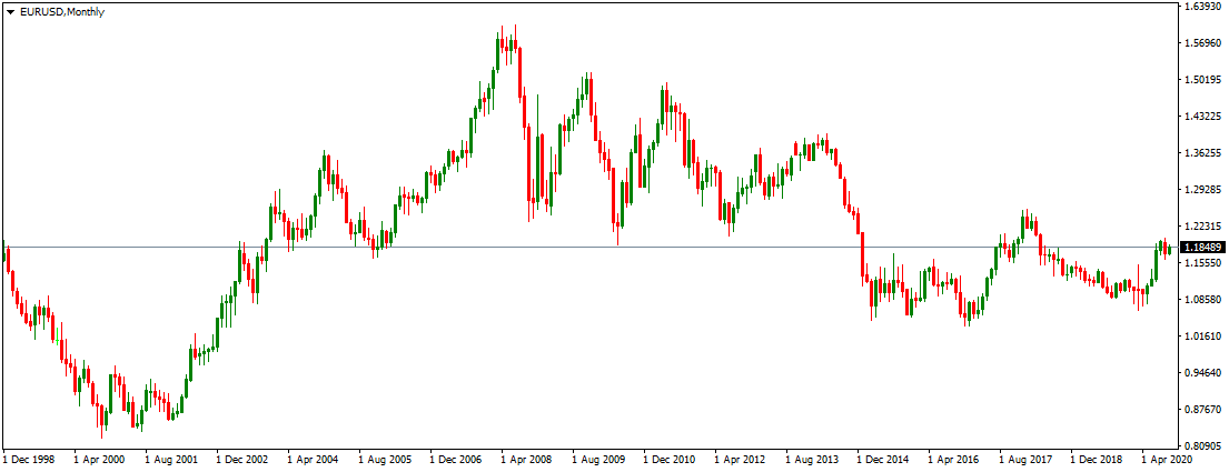
As we can see from the above image, we are dealing with three distinct long term trends. Firstly, from 1995 until 2001 the US dollar has made steady gains against the single currency, eventually overcoming the parity level in early 2000. By 2001 the EUR/USD pair had dropped all the way down to the $0.85 level.
Now, at this stage some people might be surprised, how can we talk about the EUR/USD exchange rate in 1995, when the Euro was first introduced only in 1999.
Well, the fact of the matter is that before the introduction of the single currency, there was so-called the European Exchange Mechanism, also known as the ERM. Consequently, all those countries which later formed the Eurozone had their exchange rates pegged to the European monetary unit, also known as EMU. So, essentially EMU is the predecessor of the Euro, and traders and analysts can use its exchange rate as a Euro exchange rate.
Returning to our EUR/USD analysis, it seems obvious that since 2002, the pair has begun a strong upward trend, pushing the single currency all the way up to the $1.59 level. In addition to that, we can notice that in 2008 the EUR/USD upward trend has hit a wall and the pair began its long term decline, with the pair eventually dropping to the $1.06 level in 2016.
At the moment the situation seems rather unclear. In fact, the single currency did try to break out of the downward channel in 2017 and still tries to do so in 2020 as well. However, as we can see from the above diagram, it is difficult to identify the latest trends without an advanced candlestick pattern analysis.
Example of the Renko Chart
Now, the obvious problem with candlestick charts, such as we have seen above, is the fact that many traders are simply not skilled in analyzing and identifying specific candlestick patterns. The long term trends seem relatively clear, but shorter term trends are much more difficult to identify. In fact, for many market participants, the regular candlestick charts can be too confusing to work with.
This is exactly where the Renko charts come into the play. The fact of the matter is that they are much easier to read and it does filter out the daily noise at the market. In order to illustrate this, let us take a look at this weekly EUR/USD Renko chart, covering the same period:
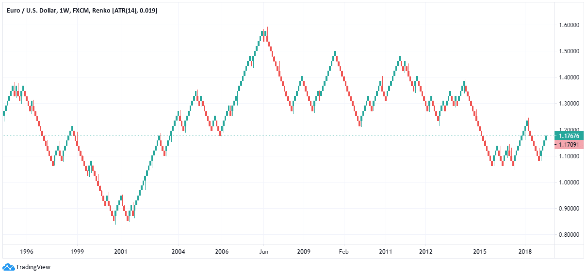
Now, despite the fact that both of those charts are displaying the same period, it is safe to say that in Renko charts the trends for each period seem much more clearer than on regular candlestick charts.
Indeed, it seems quite clear that the EUR/USD exchange rate has gone through many more changes and stages, than just 3 distinct periods. In fact, this chart reveals to us that during early 1995 the US dollar was still downward trend, with the pair rising to the $1.35 level by the Summer of the same year. This is the point, where the first long term US appreciation began during this period.
In fact, we can see that this downward trend for the EUR/USD pair has persisted until 1998, with the US dollar making some important gains during this period. However, the year 1998 itself turned out to be an exception to those latest trends. In fact, during this period the European currency had a relief rally, regaining some of the lost ground in the process.
However, those gains were proven to be temporary, as, from 1999, the US dollar simply resumed its appreciation, a trend which persisted well into early 2002. In fact, during 2000, the EUR/USD pair has even reached an all-time low of $0.83 level.
Just like we can observe from the previous chart, here on the Renko diagram, we can also see that the year 2002 has marked the recovery of the European currency. In fact, this upward trend has persisted for several years. Yet, it is also obvious that this was definitely not the case of the Euro appreciating with a straight line without any major corrections.
The year 2005 was very similar to 1998 in the sense that it has disrupted a major trend, but this time, this disruption was in favor of the US dollar, which has made substantial gains during this period. However, this did not make any major reversal, as the USD simply resumed its depreciation from 2006.
On the other hand, July 2008 marked a turning point for the EUR/USD pair. After going as high as $1.59, the pair quickly dropped to $1.30 before the end of the year. During the subsequent years, the Euro had a major rally for 4 times, but in each case, the highs were getting lower and as a result, the pair remained well within the long term downward channel.
Another wave of major losses for the single currency came during 2014 and 2015, as a result of which, the pair fell all the way down to the $1.05 level. Now, at that time many financial experts and commentators were predicting that the American currency would soon overcome the parity level against the Euro, just like in 2000. However, those predictions were proven to be inaccurate.
Instead, what we see during this period is the indecisive fluctuations until 2017. In 2017, there was a major attempt by the Euro to break out above the long term downward channel. Yet, the attempt failed and by 2018, the pair was back to below the $1.10 mark. We can now see that once more in 2020, the single currency tries to rally and begin another major upward trend. So far there are 4 green bricks in the row, which suggest that there is some strength behind the latest trend
However, we can also observe that the EUR/USD pair has to break above the $1.25 level, for it to take out the 2017 highs and resume its appreciation. If this fails yet again, then we can conclude that EUR/USD pairs are still firmly into the long term downward channel.
Benefits of Using Renko Charts
So as we can see from this example, the Renko chart has proven to be more informative and clear about the long term trends of the EUR/USD pair. In addition to that, it is important to point out that identifying trends with Renko charts is much easier than with ordinary candlestick and even with Heiken Ashi charts.
It is true that the Heiken Ashi diagrams are designed in a way to trick the eyes to see the trends. However, it is still worth remembering that candles in this chart are based on the predetermined time frame. In order words, each candle in those charts is representative of 5-minute, 1-hour, 1 day, or some specific amount of time.
This means that in periods where the currency pair stagnates or is limited to a tight range, the Heiken Ashi charts will still display a large number of candles, showing the indecisive movements during this period. It goes without saying that for many traders, especially for the beginners, this can be very confusing.
One can actually say that the Renko charts act as a filter, filtering out weeks and months of indecisive fluctuations and only presenting the market participants with the most important trends and price movements.
Obviously, there are many traders who like to conduct a detailed technical analysis by using ordinary candlestick charts, where they can focus on patterns of individual candlesticks. However, this does require a significant amount of knowledge and some experience as well, something not all traders have.
In addition to that, it is worth noting that there are dozens of different candlestick patterns, so each currency pair might be giving contradictory signals to traders. This can be very confusing for the market participants. So this means that even if the trader is skilled in technical analysis, this does not necessarily guarantee that his or her conclusions will always be accurate. The fact of the matter is that some traders might interpret the latest candlestick patterns as a very bullish sign, but the pair then might begin to drop. The opposite is also true as well.
On the other hand, traders do not need a great deal of experience and knowledge of technical analysis in order to come up with some conclusions. Here everything is much more simple, if there is no significant movement, then the chart remains unchanged, on the other hand, if there is a major change, the diagram will display this in a very visible manner.
Here it is also worth mentioning that some market participants like to focus more on the fundamental side of analysis and do not want to spend hours in front of the charts. Those people can certainly utilize Renko charts, which can give them all of the information they need in a short amount of time.
Which Trading Strategies is Suited for Renko Charts?
At this point, the next obvious question is: what type of traders can use Renko charts most effectively? Well, the fact of the matter is that the Renko charts are available in all of the timeframes. People can use them as 1-minute charts, or alternatively as weekly charts, just like the one we have seen above.
So generally speaking, Renko charts can be successfully utilized by scalpers and the long term traders. However, it is also important to point out that some short term strategies with scalpers and day traders do rely heavily on the candlestick patterns and identifying tight ranges with different currency pairs. Consequently, those people who like to use those patterns as indicators for their analysis might be better off using the traditional candlestick charts or Heiken Ashi diagrams.
Therefore, one might argue that Renko charts might be more helpful for swing and long term traders, than for scalpers and day traders. However, as mentioned above, this completely depends on the specific strategies and techniques one uses in trading.
However, it is also helpful to point out that Renko charts can be very useful for traders who usually prefer to make trading decisions based on fundamental analysis. Those people can simply take a look at the Renko chart to confirm, whether the position they are considering to open is conforming to the latest trends in the market.
In addition to that, Renko charts are useful for those traders who want to set some profit targets with different currency pairs. By looking at those types of charts, the market participants can easily identify the scale of movements and volatility with each currency pair and come up with a realistic target with each pair.
Settings of the Renko Chart
Here it is also important to mention that just like with any other type of chart, there is no single standardized Renko chart for all the traders to use. The fact of the matter is that it has several settings. The first of those settings surprisingly is the timeframe. Now, this does not mean that there will be any bricks on the chart if there are not any significant movements.
Instead, it is worth remembering here that Renko charts are only using the closing prices of the given security, disregarding such indicators as highs and lows. So this means that if the trader specifies 1 week as a timeframe, then the computer will use the weekly closing prices for each currency pair.
Another major component in settings for those types of charts is the size of each brick. This is essentially the amount of pips the given currency pair has to move in order for the brick to appear on the chart. So for example, if each brick is the equivalent of 200 pips, then the Renko chart will not display any additional brick if the price has not moved up or down by 200 pips, regardless of the timeframe.
Generally speaking, scalpers and day traders generally prefer to use short timeframes to construct Renko charts, like 1 to 15-minute diagrams. At the same time, the size of each brick is also small, in most cases the equivalent of 5 to 20 pips.
On the other hand, when it comes to swing and long term traders, they usually prefer daily or weekly Renko charts, to make it easier to focus on the big picture surrounding the given currency pair. In addition to that, the standard size of brick is usually larger, in the majority of cases representative of 50 to 200 pips.
It is also worth pointing out that some Forex trading platforms and news websites are automatically adjusting the size of each brick with the Renko charts in accordance with the timeframe. For example, if traders choose an hourly chart, then the computer will display a Renko diagram, where one brick will be representative of 10 pip change. However, if the market participants decide to switch to the weekly chart, then the program will arrange bricks in a way that each of them will be the equivalent of 200 pips.
This is very handy for the market participants since the computer takes care of all of the necessary adjustments with different timeframes so that traders do not have to spend time on that task. It is also worth noting that some trading platforms and Forex news websites do allow the market participants to adjust the size of the bricks on Renko charts with different timeframes.
Utilizing Renko Charts – Key Takeaways
- Renko charts have their origins in Japan. They differ considerably from regular candlestick and Heiken Ashi charts in a way that they focus on the price movements, rather than on the timeframe. This means that each brick on the Renko chart is representative of the price movement by a specific amount of pips, rather than any specific time frame.
- One of the most important advantages of using Renko charts is the fact that it makes it very easy to identify the latest trends, even for inexperienced traders. The Renko charts essentially act as filters, as to filter out the daily noise from indecisive market fluctuations and present the market participants with a clear picture of the market trends with the given currency pair.
- Traders can modify Renko charts at trading platforms and the Forex news websites by choosing a different time frame for a given currency pair. The general principle here is that with short timeframes each brick on the Renko chart is representative of the small number of pips, such as 5, 10, or 20. On the other hand, in the long term Renko charts, each brick might be the equivalent of 50, 100, or even 200 pips.